-
[메인프로젝트] Button component 구현IT/회고 2023. 8. 30. 16:13
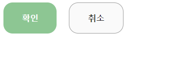
Modal창에 쓰일 버튼 컴포넌트 스타일을 정의해봤습니다.
Figma의 오른쪽 상단에 있는 Dev Mode를 클릭해서 구현 예정인 컴포넌트의 CSS 코드를 구할 수 있었습니다.
피그마

CSS 코드
/*버튼 공통 코드*/
.custom_button {
    display: inline-flex;
    height: 50px;
    padding: 23px 30px;
    justify-content: center;
    align-items: center;
    gap: 10px;
    border-radius: 15px;
    font-weight: bold;
}

/*확인버튼*/
.confirm_button {
    background-color: #8DC693;
    border: none;
    color: white;
    margin-right: 20px;
}
/*취소버튼*/
.cancel_button {
    border: 1px solid #9E9E9E;
    background-color: #FAFAFA;
    color: #2B2B2B;
}
HTML 코드
        <div>
        <button class="custom_button confirm_button">확인</button>
        <button class="custom_button cancel_button">취소</button>
        </div>
결과화면
'IT > 회고' 카테고리의 다른 글
[메인프로젝트] Redux 사용하여 NavBar 컴포넌트 구현 (0) 2023.08.30 [부트캠프] 코드스테이츠 FE45 Section3 회고 (0) 2023.07.06 [부트캠프] 코드스테이츠 FE45 Section2 회고 (0) 2023.06.08